More than 90% of the data in the world has been created in the past two years. Don’t take my word for it, though. I’m just citing a statement made in this SINTEF article. Published more than four years ago, this article is the source I routinely see in presentations on how data continues to grow at an exponential rate.
I believe we continue to create, and curate, data at an accelerated pace with each passing year. Today we have access to more data than ever before. Everyone I meet will say they manage more data today than a year ago.
The data explosion has given rise to a never-ending marketing lexicon. The first one I remember being used widely was data warehouse. That was soon followed by a data mart. Today, we also have a data factory and a data lake, which is a nice feature to have next to our data estate.
With so much data available, information is cheap. It's easy for us to get data about anything. We are drowning in data, inundated with metrics with every step of our day. The trouble with such easy access to data is this: When information is so cheap, attention becomes expensive.
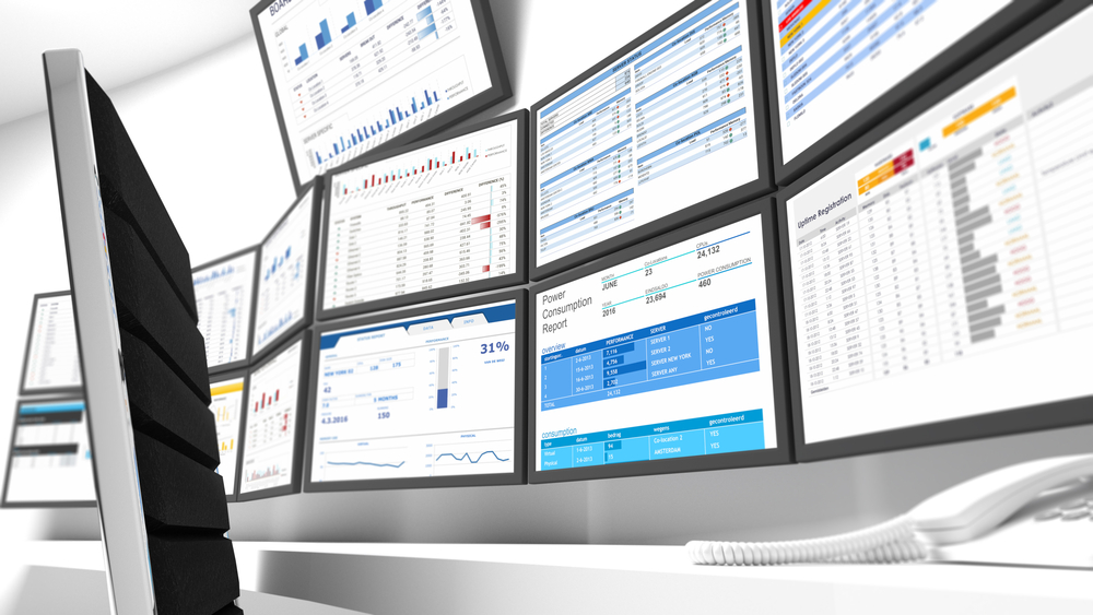
One attention-grabbing trend is the rise of dashboard reports. Dashboards themselves are not new; they’ve been around for years. It’s the ease in which they are created and consumed that has driven demand. The phrase “pin it to your dashboard” has become common for users of tools such as Power BI.
For C-level executives, dashboard reports are essential. Executives don’t have time to review details for every decision they make; they just want to consume a report that has red, yellow, and green to help them make decisions for the day. However, cubicle-dwelling system administrators also need such dashboards to help them understand where to focus their daily efforts to keep operations running.
The trouble with these dashboards is that they are often a horrible way to communicate.
The dashboards need data in order to exist. A good dashboard is able to communicate the story that the data is trying to tell. But the data contains the details necessary for that story, and those details are often left behind. Offering users the ability to drill through to get the details is a solution, but the whole point of a dashboard is to avoid having to review the details.
A common example I often use to explain why dashboards aren’t always useful involves disk space usage. Let’s say that a disk is at 90% of capacity, and the dashboard shows a big red circle for this metric. The trouble now is that you are missing important details. A 1TB disk at 90% is a different situation than a 10TB disk at 90% full. You also need to know how full the disk was yesterday, what the growth trend has been over time, and at what point will the disk be completely full.
While those details might help you figure out what steps to take next, they do little for your end user. This dashboard reporting a disk at 90% has little meaning to the end user, who only wants to be able to get his or her work done for the day.
With so much data coming across our desk each day, we need to start finding ways to have the data communicate effectively to anyone. We need dashboards that can help data to communicate in a manner that is easily understood by anyone.
Saying your disk is 90% full is not nearly as effective as saying that you only have space for three more Netflix movie downloads. That’s a story that anyone can understand. Even simple things like bar charts do a better job communicating the story that the data is trying to tell. And I have yet to meet a manager who doesn’t understand a bar chart.
Those of us who work in IT are always asking for more. We want more space, more memory, more CPU, more bandwidth. It’s time we also ask for more ways for our data to tell a story that everyone can understand.


