I occasionally download and check out the current Wireshark development release, which has been in the works for nearly two years. The main attraction of the updated open source network protocol analyzer is that it will introduce everyone to the Qt interface, which promises to be more responsive and generally improve Wireshark performance.
I recently put Wireshark version 2.0.0rc2 through its paces throughout the day to see if I can use it for my day-to day work and training. Far from being a comprehensive review, this blog covers my thoughts and general impressions of the current development version.
Documentation: As I expected, it was very challenging to find documentation about the current new features regarding 2.0.0rc2. The user's guide still references 1.99 and the revision history shows the last data as November 2014. This is not a criticism, just a FYI for those that haven’t ventured into the development version before. Be prepared to figure things out on your own. If you do have questions, post them in the Q&A section on the Wireshark site.
Packet Editor seems to be removed, or not added yet. This made me chuckle since I just wrote a blog about this relatively new feature, how much I liked it and hoped the Wireshark development community continues to develop it. Fingers crossed that this feature is just low on the priority list and hasn't been eliminated.
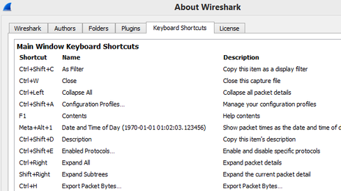
Nice addition: I like the added keyboard shortcut/accelerator keys under "About Wireshark."
Puzzling button: For those not familiar with trying out development versions of software, sometime you run into a button that doesn’t seem to do, like this checkbox under Preferences -> Appearance -> Layout
Familiar settings have been moved:
- Hide Interfaces is no longer in the Edit-> Preferences- Capture screen, but in the Capture Interfaces under the Manage Interface Button
- And then there are things you take for granted until you can’t find them. For example, I could not figure out how to display the Wireshark version info in the title bar.
- No Apply button in the Preference screen.
- Statistics summary screen is now combined with the Capture file properties button in the bottom left corner.
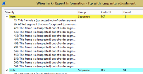
Layout: I personally prefer the old Expert Info Tabs rather than this tree layout, which gets hard to navigate when there are many entries.
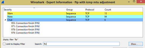
Maybe that’s why they added the Limit to display Filter and Search Filter
Packet list formatting: The arrows are helpful to indicate where the command and responses are, but I haven’t figured out the vertical lines yet.
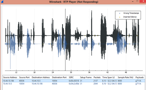
RTP Player: The new VoIP/Player looks nice, but froze when I tried playing several VoIP trace files.
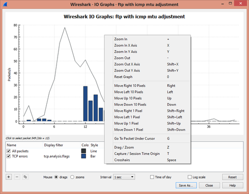
Statistics IO graph: I love the new Statistics -> IO Graph, but hope they will put the copy feature back in.
Merging files: In the previous version of Wireshark, you could drag and drop multiple trace files, which resulted in a new file that was merged chronologically. In the new version, you just end up with opening one of the files you dragged and dropped.
Formatting issues: I found some minor formatting issues in the Follow the Stream screen that make it pretty well unusable.
Generally speaking, the new interface and menus in Wireshark 2.0 are definitely quicker, more responsive and cleaner. This version is by far the most stable and usable version of Wireshark. I can’t wait to see the finished product, but hope they put back some of my favorite features/options.


